Biography

My name is Joseph Davies.
Currently located in Norwich UK.
Certified in Art Foundation and Graphic Communication.
Soon to be graduate at NUCA, Illustration BA (Hons).

Content

Showing posts with label Ink. Show all posts

"Too Heavy for Cherubs"

Thursday, 17 March 2011 1 comments
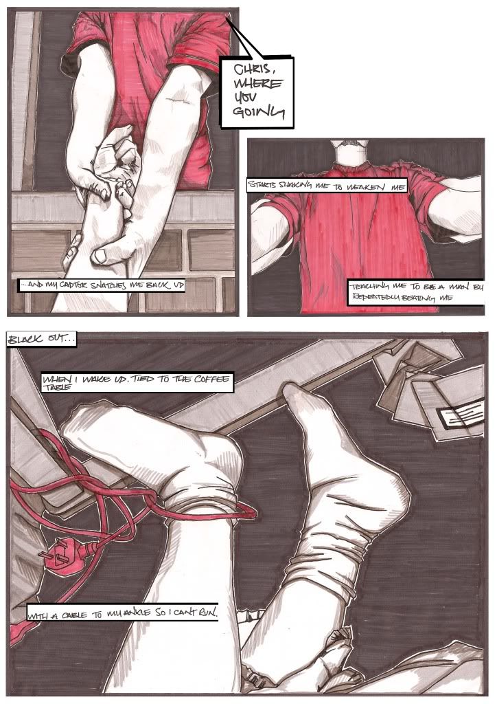
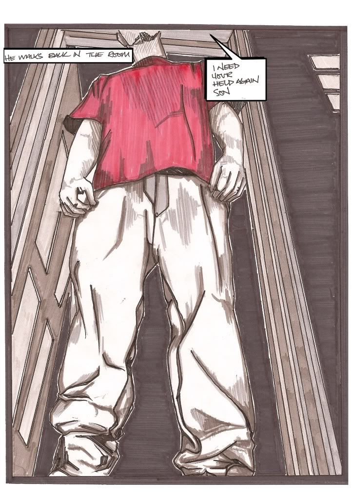
I decided that I wanted to have a go at illustrating a song because music is such an important part of my life.

I chose to use Cage's "Too Heavy for Cherubs" because I like the song, but also because I felt that it lent itself particularly well to being illustrated.

As this was only a 2 week project I knew I didn't have time to fully portray the whole song, and so picked out just one section that I could envisage strong images for.

I made a conscious decision to not show any faces in the images. I thought that leaving the abusive father figure faceless added to the fear of the unknown. By leaving the protagonist a mystery, whilst having all the scenes shown from his perspective, it would make him seem more accessible and provoke empathy from the viewer.

I used black pen and ink and markers, and set the pictures out in a comic book style in order to make sure the narrative was shown in order.


A Journey

Wednesday, 2 February 2011 0 comments
For this project I had to create a narrative without the use of text or figures.

I decided to focus on the relationship between childhood memories and my current perceptions.

I went to Islington in London (a place where I spent every weekend for about 3 years of my youth), to see how much the area had changed. I made a book with linked images that could be unfolded to create one long journey, combining the idealised impressions of my boyhood, with the reality I witnessed more recently.

To contrast with the harsh pen and ink outlines, I used bright watercolours to create a dreamy, child-like atmosphere to the images.

Below are the first few pages of the finished book.


Brand Identification

Tuesday, 28 December 2010 0 comments
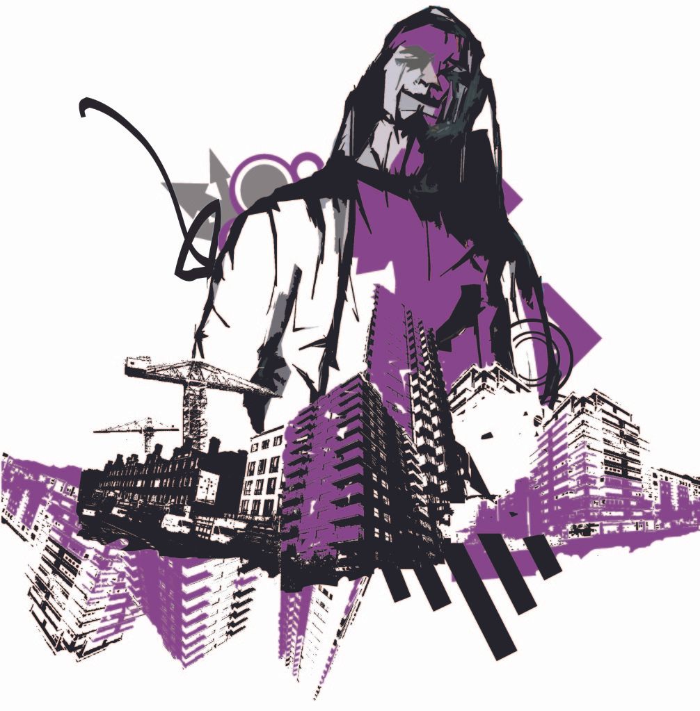
The below image is one of a series that I completed during my Graphic Communications course. The brief was to create a set of images that advertised a certain (real or imagined) clothing brand.

I chose to create images for marketing posters, for an imagined streetwear label. I wanted my images to be bold, bright and eye-catching, to appeal to as many prospective customers as possible, but without compromising the integrity and ethos of the company.

I combined hand drawn images of figures in the garments with parts of photographs I took of skyscrapers, other modern city buildings and cranes.

Each image I produced used just one bright colour, to highlight certain aspects of the picture. The colour was also used to tie in the drawn parts to the photographs and give a sense of the link between the garments and the urban environment.


Fineliner Faces

Saturday, 18 December 2010 0 comments
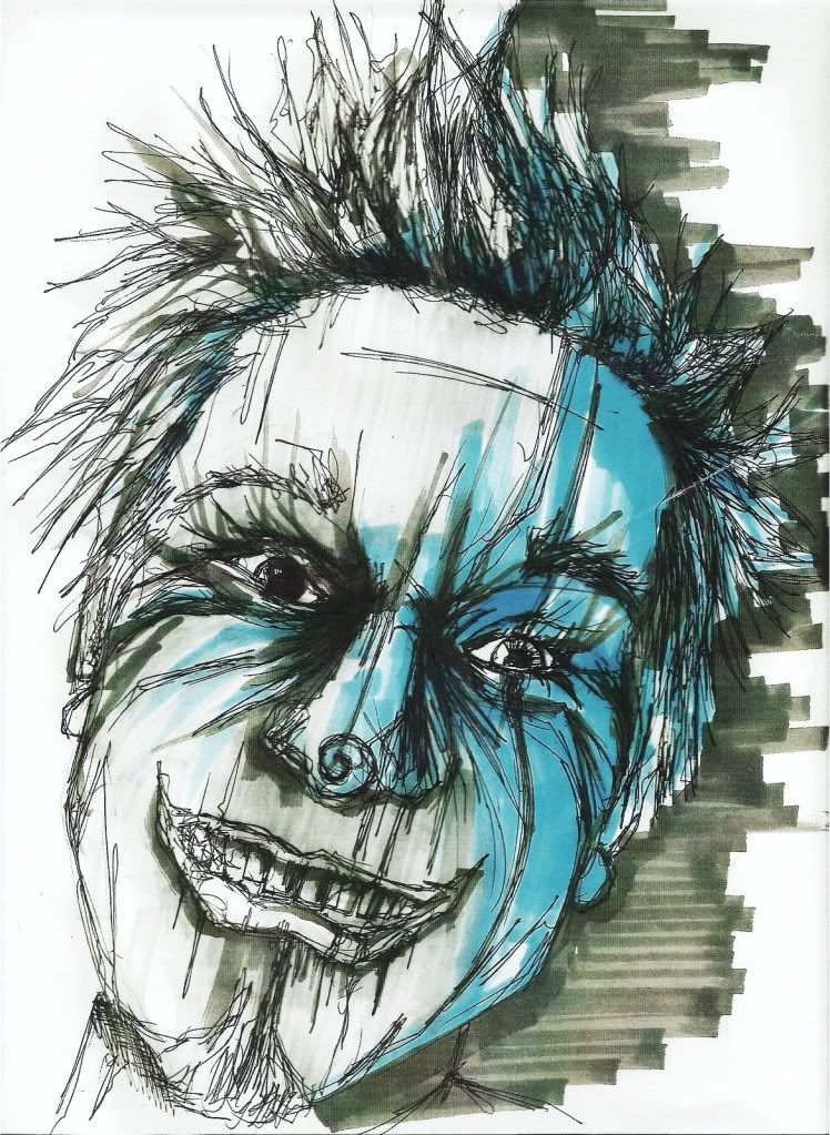
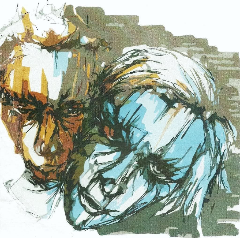
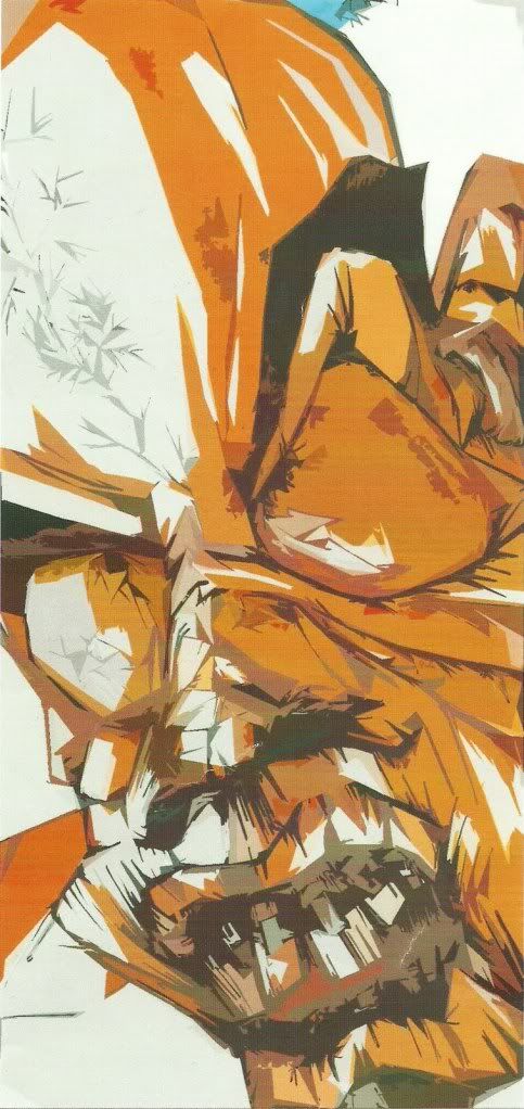
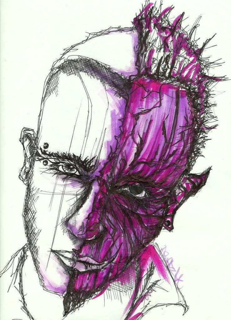
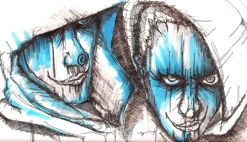
I enjoy sketching portraits. Generally I have used friends/family as inspiration, but have also drawn some from imagination.

My preferred medium is fineliner with colour markers. Sometimes I will scan in the original sketches in order to manipulate the colours and play with various filters.

Below is a small sample of my collection, which dates back to 2008.