Biography

My name is Joseph Davies.
Currently located in Norwich UK.
Certified in Art Foundation and Graphic Communication.
Soon to be graduate at NUCA, Illustration BA (Hons).

Content

Showing posts with label Hip Hop. Show all posts

"I Phantom" Exhibition

Thursday, 16 June 2011 0 comments
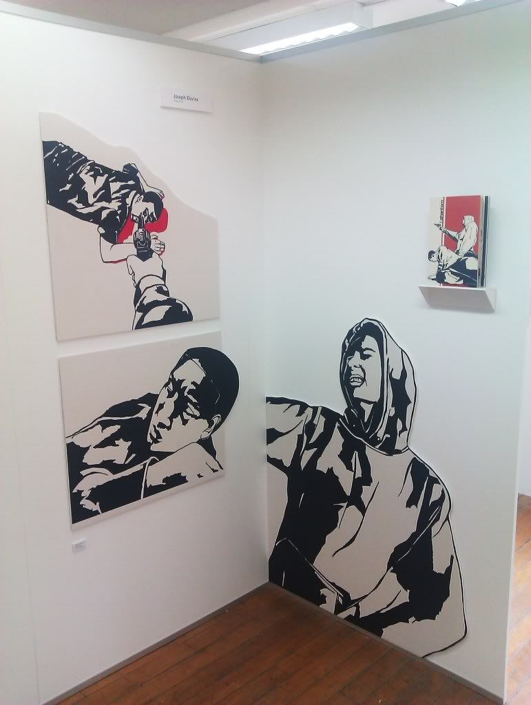
For my degree show I decided to exhibit my "I Phantom" work.

I blew up 3 of the images to over 20x their comic book size and mounted them on to 2 boards. I wanted to show them this big in order to give the viewer the feeling of being able to step into the comic book, and also having them at this size showed the intricacies of the drawings, some of which was lost in their shrinking.

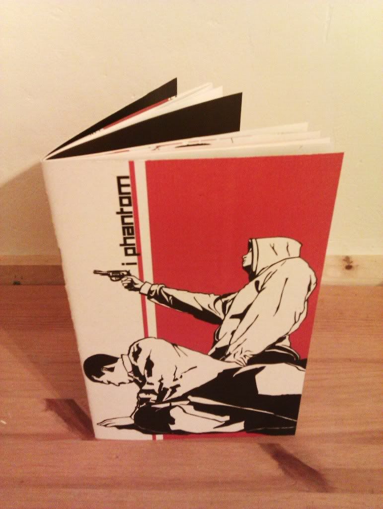
Below are photos of the exhibition and the finished book.


"I Phantom" Comic Book

Wednesday, 15 June 2011 0 comments
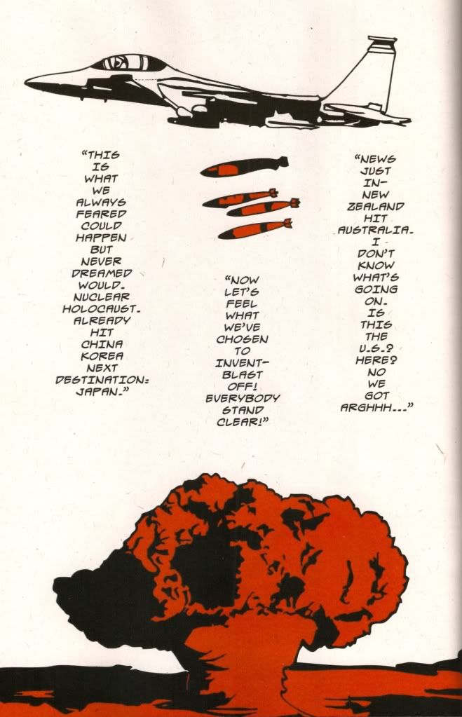
This was my final degree project, which culminated in a 28 page comic book based on and inspired by Mr Lif's concept album "I Phantom".

I chose to illustrate this particular album because I felt that it gave me the opportunity to explore different themes, and because it has a continuing storyline throughout which made it more suitable for being put into comic book form.

The album tells of a man who goes through struggles in order to make a good life for himself, but in focusing on the monetary factors of raising a family, neglects his wife and child's emotional needs, and so ends up alone at the end of the world.

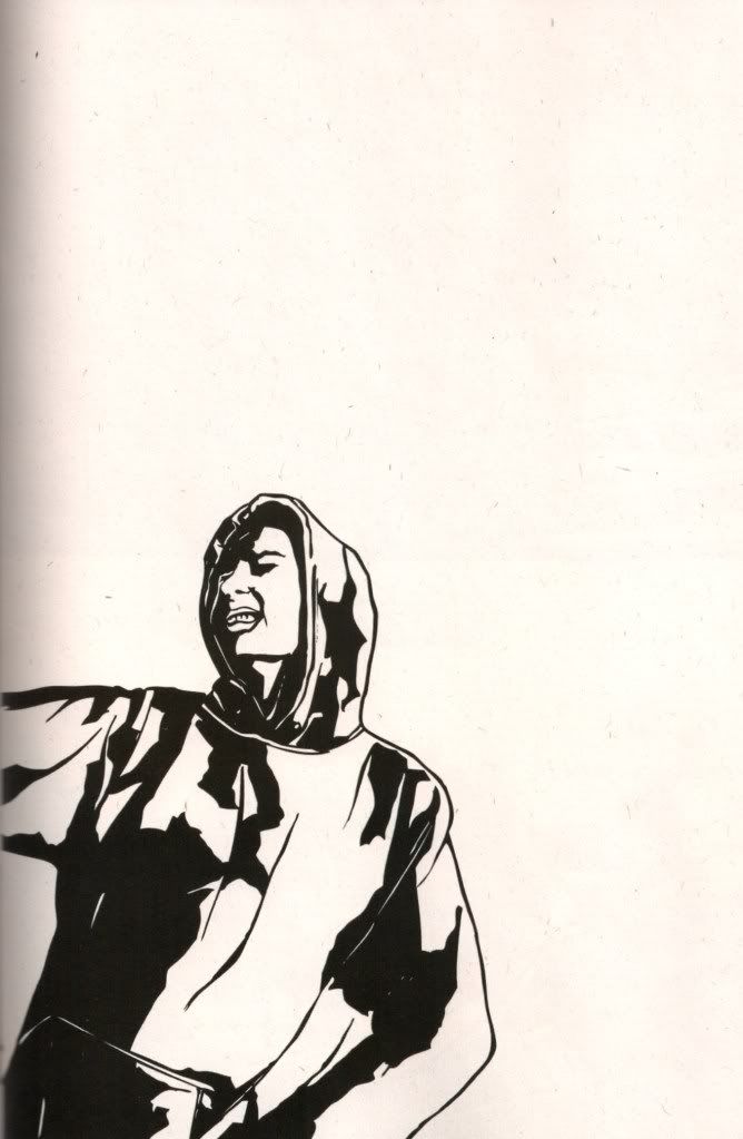
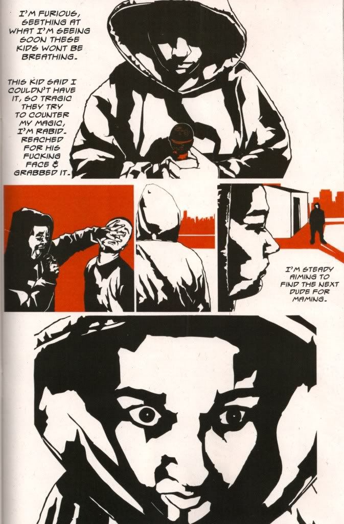
I drew all of the images in the book by hand, and then digitally manipulated them to give them a more polished appearance. I used just 2 colours to highlight the images, depending on the mood of each song. Red signified anger, danger and nightmare/dream sequences; Blue symbolised calm, monotony and despair.

These are 3 pages from the finished comic book -


"Too Heavy for Cherubs"

Thursday, 17 March 2011 1 comments
I decided that I wanted to have a go at illustrating a song because music is such an important part of my life.

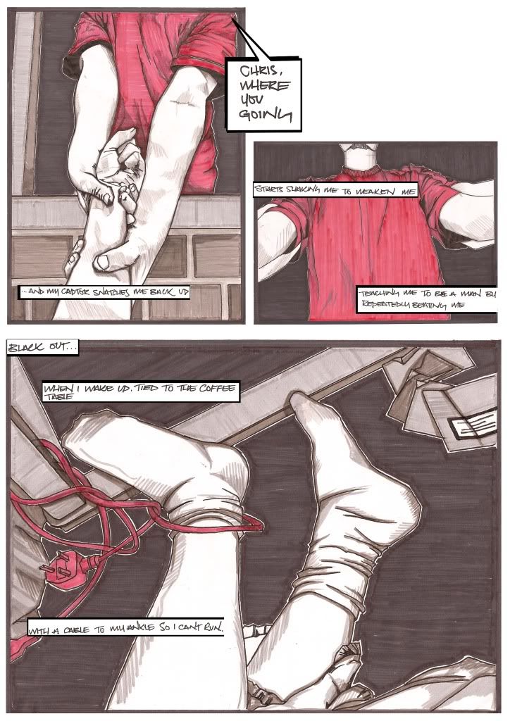
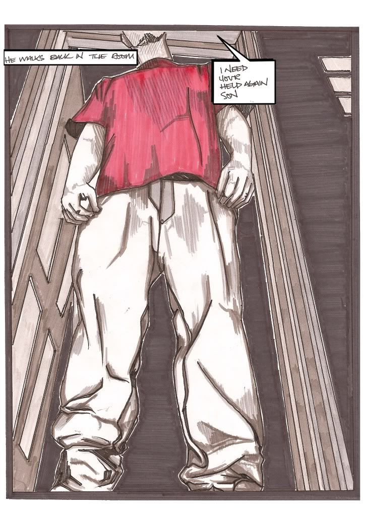
I chose to use Cage's "Too Heavy for Cherubs" because I like the song, but also because I felt that it lent itself particularly well to being illustrated.

As this was only a 2 week project I knew I didn't have time to fully portray the whole song, and so picked out just one section that I could envisage strong images for.

I made a conscious decision to not show any faces in the images. I thought that leaving the abusive father figure faceless added to the fear of the unknown. By leaving the protagonist a mystery, whilst having all the scenes shown from his perspective, it would make him seem more accessible and provoke empathy from the viewer.

I used black pen and ink and markers, and set the pictures out in a comic book style in order to make sure the narrative was shown in order.


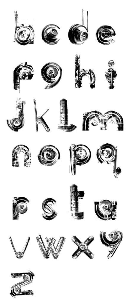
Illustrated Alphabet

Monday, 28 February 2011 0 comments
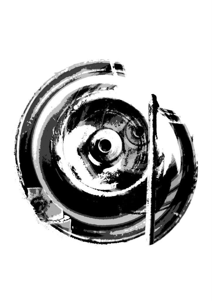
This brief was quite open, calling for me to create an alphabet based on any theme or subject I desired. I chose to create a usable font, corresponding to the English alphabet, with imagery as its basis, on the theme of Hip Hop.

I decided to focus on Graffiti, being the "visual embodiment of Hip Hop". I did not want to go down the obvious route of designing graffitied letters, and so instead opted for dismantling the physical components of a spray can, and re-positioning and layering images of these components to create a legible typeface.

The font is intended to be symbolic of the roots of hip-hop, based around the four elements, and designed specifically for use on posters promoting certain aspects of the elements.